Ravensara Sans
Affiliate Disclosure:
SpecMeOut may earn a commission from the links on this site, at no extra cost to you.
Thank you for supporting SpecMeOut.
Product Specs
| Deal Type | |
|---|---|
| Reviews Count | |
| Questions Count | |
| Availability | |
| Stacking Type | |
| License Type | |
| Stacking Maximum | |
| Date Days | |
| Date End | |
| Date Price Valid | |
| Date Published | |
| Date Start | |
| Marketplace |
Product Description
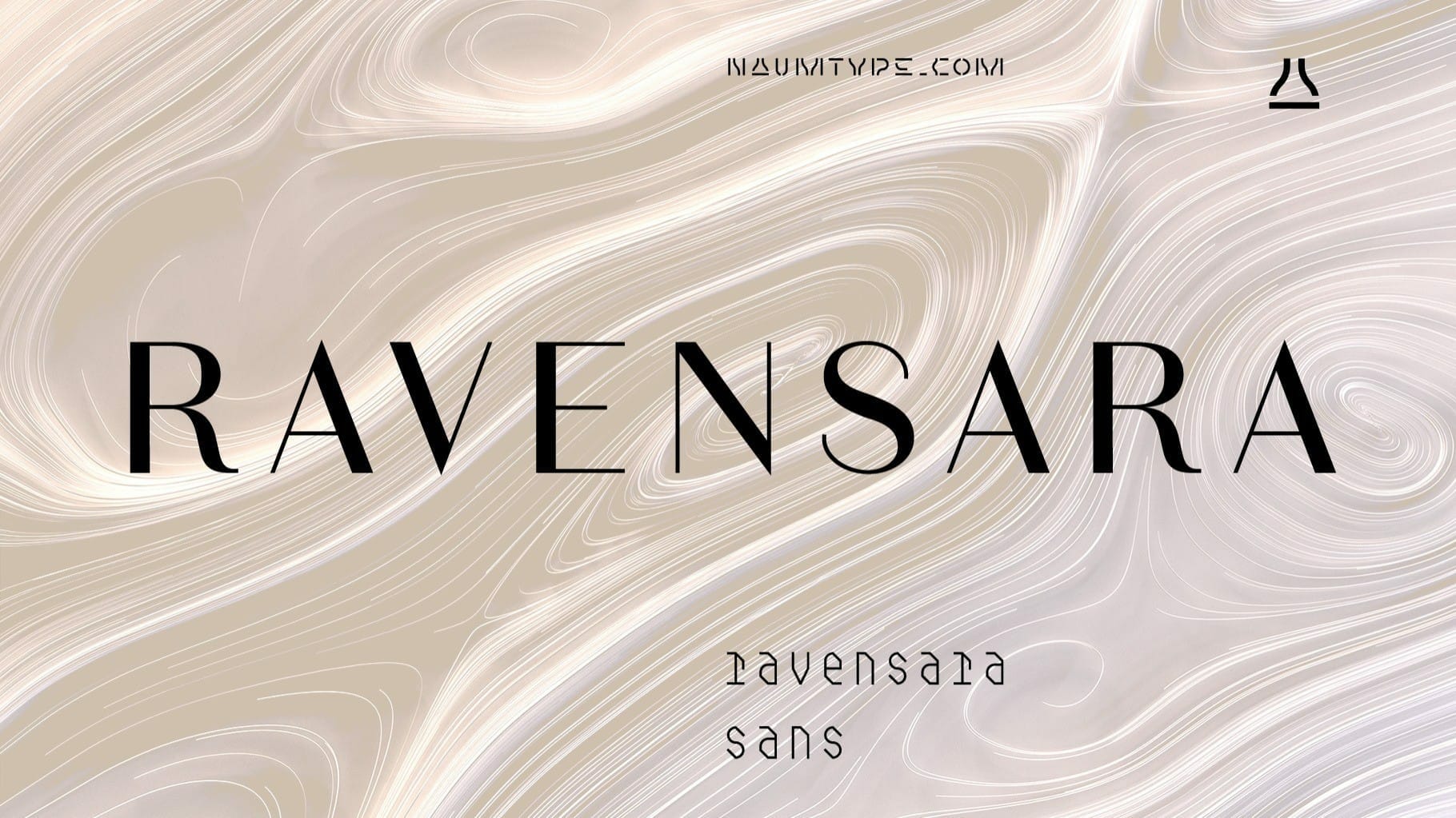
Ravensara Sans — fashionable, high-contrast humanist sans.
Ravensara family was born from the idea of taking the Didone concept to weight extremes.
Thus, following this idea, the thinnest weight became the thin monoline style, and the widest — the maximum contrast Didone.
Basically, the vertical stems weights vary through the styles while the horizontal staying thin.
Ravensara Sans is available in 7 weights, including Thin, Light, Regular, Medium, SemiBold, Bold, and Black.
Depending on weight, Ravensara Sans, like the other members of this font family, show quite different behavior.
Heavy weights function above all as display fonts and work particularly great in all-caps.
Medium weights of Ravensara Sans represent humanist grotesque, descended from the pages of fashion magazines.
Thin weight perfectly complements the others if you need an especially wide choice of weights.
Also, all the weights work great in all caps.
If you are in need of that classic Haute Couture look — Ravensara Sans is a great choice.
It’s a perfect choice for fashion logos, headlines, short texts, magazines, due to its simplicity looks great in oversize typography, branding, identity, website design, album art, covers, posters, advertising, etc.


