Juxta Sans
Affiliate Disclosure:
SpecMeOut may earn a commission from the links on this site, at no extra cost to you.
Thank you for supporting SpecMeOut.
Product Specs
| Deal Type | |
|---|---|
| Reviews Count | |
| Questions Count | |
| Availability | |
| Stacking Type | |
| License Type | |
| Stacking Maximum | |
| Date Days | |
| Date End | |
| Date Price Valid | |
| Date Published | |
| Date Start | |
| Marketplace |
Product Description
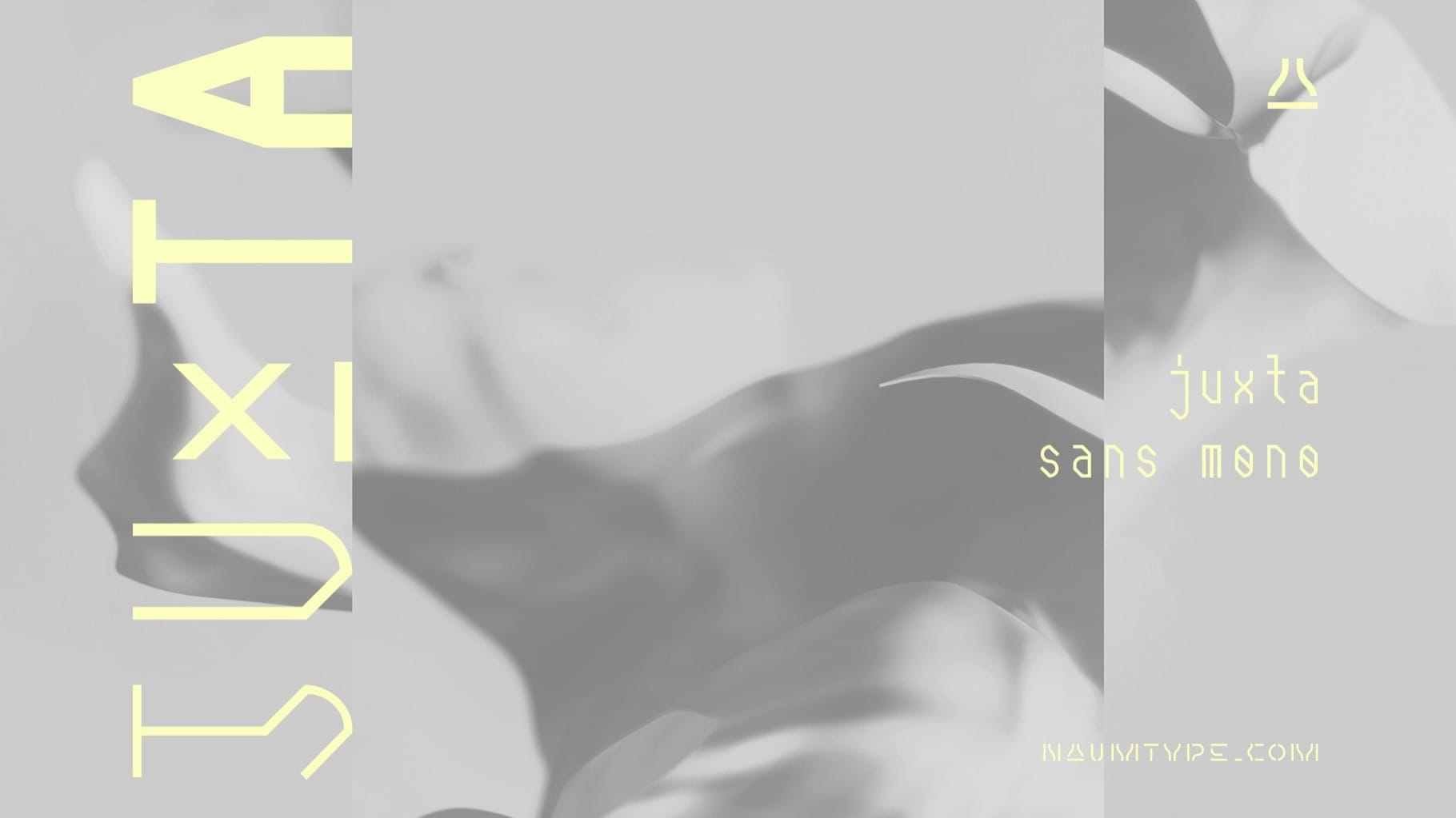
Juxta Sans Mono is an experimental monospace sans, an extension of the Juxta superfamily.
Juxta has several style-forming elements: 45° beveled or cross-out bowls, squared m and w arcs, and other unobvious letter structures.
Despite its unusual and sometimes odd (f, g, m) letterforms, Juxta Sans is fairly easy to read due to its monospace font nature and wide spacing.
Juxta Sans Mono has two sets of stylistic alternates — [salt] makes a letter underscored, but keeps it in line, [ss01] replaces some of the glyphs with different letterforms.
The [case] function automatically adjusts the height of the punctuation marks to the neighbor letter and [onum] is a set of old-style numbers.
Juxta Sans Mono also has subscript and superscript features, but they are utilized a bit unconventionally — if you want to customize your logo or headline, you can make a glyph superscript and the one next to it subscript and they automatically kern into one letter width.
Juxta Sans Mono is available in 8 weights and it extends multilingual support to Basic Latin, Western European, Euro, Catalan, Baltic, Turkish, Central European, Pan African Latin, Afrikaans, and Basic Cyrillic for exceptionally far-reaching global accessibility.


